PetroPlot Tutorial
Add Data Label (XY chart) function
Purpose:
Excel automated data labels are limited to either X values or Y values.
Customized labels such as sample names, locations, and references etc.
are more valuable information on a plot.
With PetroPlot, any kind of information can be labeled,
and adding customized labels is as easy as to add Excel default labels
We also imported a set of label tools from Rob Bovey (www.appspro.com).
"Bovey Chart Labeler" adds labels to a variety of chart types, including XY Scatter, Line, Column, Bar etc.
"Bovey Chart Labeler" moves labels of a whole series (Excel doesn't allow this type of movement by default).
Please visit Bovey Chart Labeler...
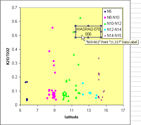
Add label to a point:
Select a point on XY scatter chart.
(Excel tip: Clicking a point once gives you the selection of the whole series.
Clicking the same point again gives you the point. NO double-clicking. )
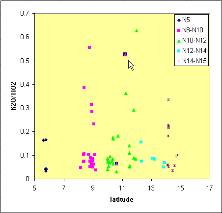
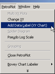
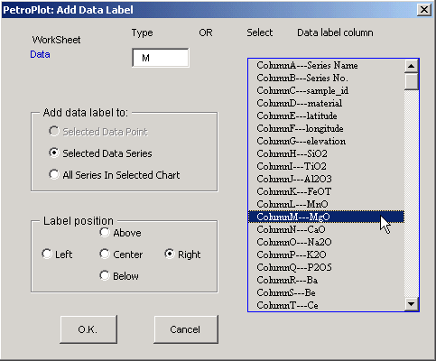
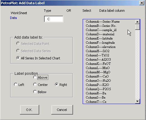
Click PetroPlot --> Add Data Label (XY Chart)
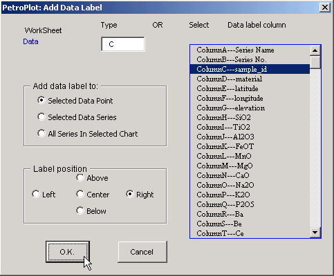
Select label type & position
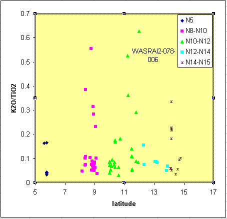
Result:
Remove data label for a point:
Select the label. Then hit the "Delete" button on your keyboard
(Excel tip: you may need to click the label twice to select the label.
Warning: NO double-clicking. )
Add labels to a series:
Select a series or a point on XY scatter chart.
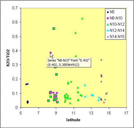
Click PetroPlot --> Add Data Label (XY Chart)
Select label type & position
Result:
Remove labels for a series:
Select the labels for a series Then hit the "Delete" button on your keyboard
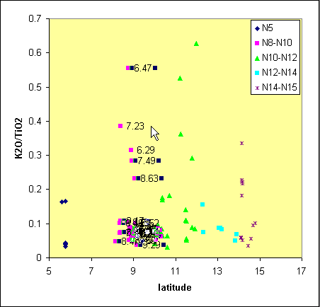
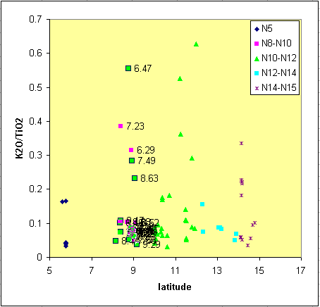
Add labels to all series in a chart:
Select a point, a series, or the whole chart on XY scatter chart.
Click PetroPlot --> Add Data Label (XY Chart)
Select label type & position
Known problems:
1. Not XY Scatter.
If there exist lines connecting scatter points, the PetroPlot program won't continue.
Details...
2. Data from other sheets or other files.
All series need to come from the SAME SHEET of the current workbook.
Details...
Last modified 05/10/2002, Yong Jun Su
This line marks the end of PetroPlot Tutorial: Add Data Label (XY chart) function