PetroPlot Tutorial
ChangeXY function
Purpose:
This function changes axes for all series in a single XY plot, while preserving the format of a chart.
It is useful for generating multiple high-quality plots with complex formatting,
especially when there are a large number of series.
For example, the formatting of the XY charts follows Excels default settings,
which might be unsatisfactory.
In the following, series 1 uses blue diamonds, series 2 uses pink squares,
and series 3 uses yellow triangles, etc. You may want to change the colors or the shapes
Start:
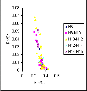
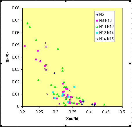
Format the diagram as you want. This is your template.
Step 1:
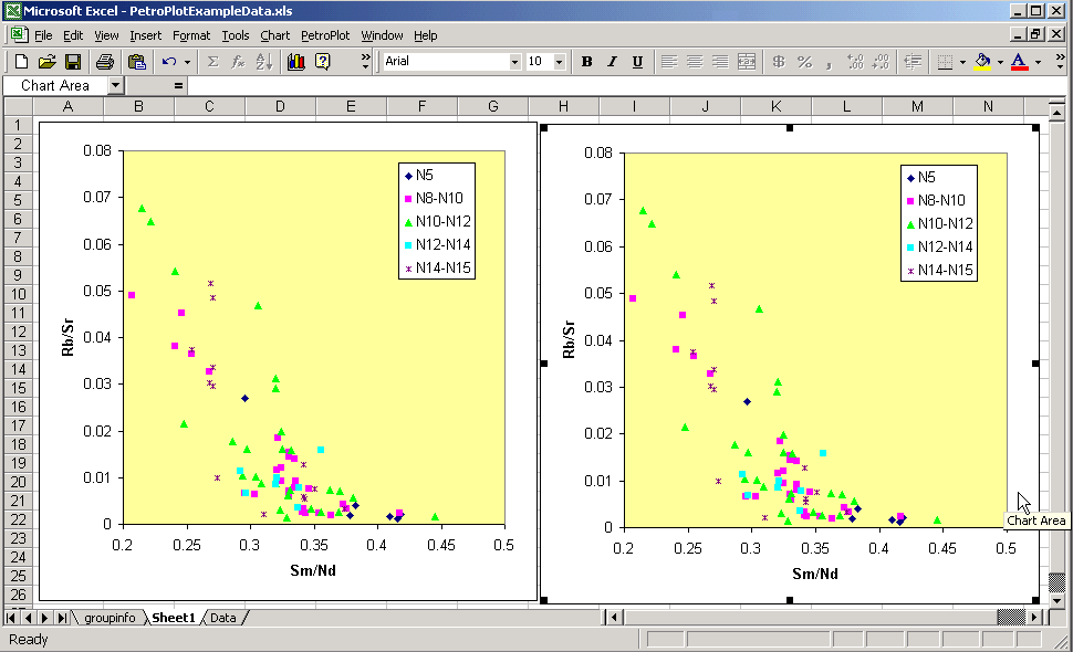
We suggest that you copy the template to other place inside this workbook.
(The ChangeXY function does not work if a chart contains data from other workbooks.)
Step 2:
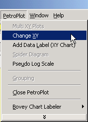
Select the diagram Click the PetroPlot --> ChangeXY button.
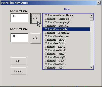
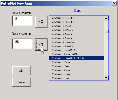
Step 3:
Change the X or (and) Y axes.
This example changes X axis.
This example changes Y axis.
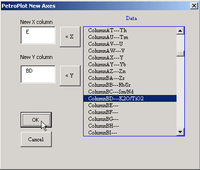
Step 4:
Click the "Next" button.
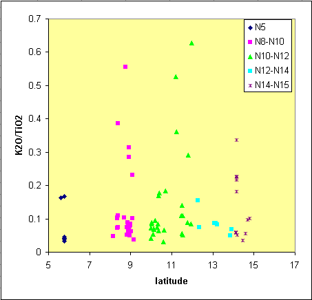
Step 5:
The scale of new plot needs to be manually adjusted.

Result:
Known problems:
1. Not XY Scatter.
If there exist lines connecting scatter points, the PetroPlot program won't continue.
Details...
2. Data from other sheets or other files.
PetroPlot only changes series with data from the current workbook. All series need to come from the SAME SHEET.
Details...
3. Pseudo log scale charts.
PetroPlot currently doesn't changeXY on pseudo-log-scale plots. Future version might add this function.
Last modified 05/10/2002, Yong Jun Su
This line marks the end of PetroPlot Tutorial: ChangeXY function